Saturday 30 November 2013

Editing Photos

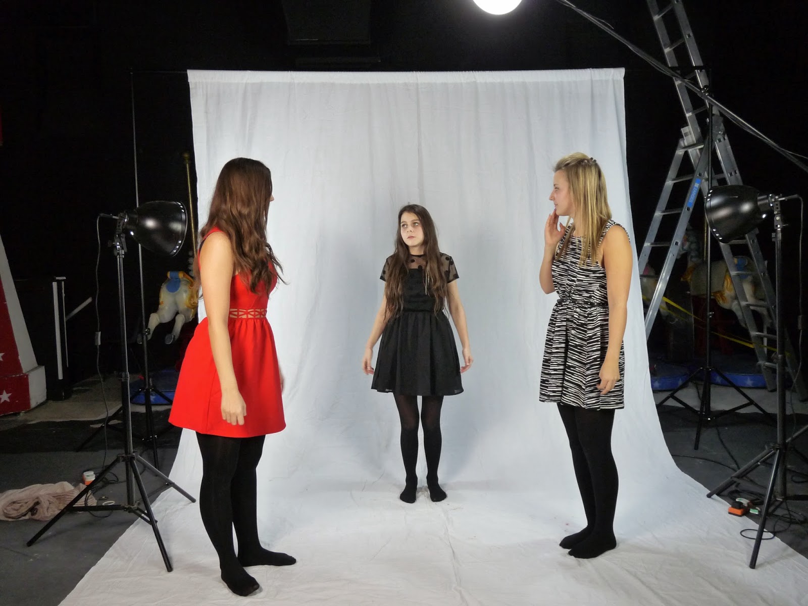
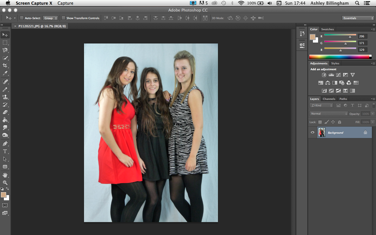
I started by uploading the image that I chose up to photoshop.
I then chose the 'magic eraser tool' from the tool bar along the side of the screen.
I then started removing the background bit by bit, not touching the models within the image.
Once i had removed the background, i chose the 'eraser tool'.
I used this tool to clean up edges around the models and any part of the background which could have been left behind.
Then once that was complete,  i was left with my final edited image. 

(This was the process i used with all of my edited images, as i only ever wanted to remove the background from them and that is all.

Friday 29 November 2013

Overall Photos I Have Chosen For My Front Cover

 
I have chosen this image as my primary image on my front cover as I think it is a good way to introduce the girl band 'PIKK 'N' MIX' for the first time in the magazine. The image backs up Naomi Wolf's theory, of by using attractive women on the front cover, it sells more magazines as other women want to be like them/aspire to them and men buy the magazine because they find the women appealing.


I used this image as my secondary image on my front cover page because I wanted to continue with the theory of Naomi Wolf, and also I wanted to be able to put an image with a side story on my front cover, and so I decided to call her 'PINK!', because she is a well known artist in the charts, meaning that people will want to read about her due to her popularity.

Thursday 28 November 2013

Possible Photos To Use For My Front Cover


I have chosen these 3 images as possibilities to use for my front cover as they all show that the  models (or the girl band PIKK 'N' MIX) have a close relationship and also they look attractive too which continues in with the Naomi Wolf's theory which i aim to use. 

Wednesday 27 November 2013

Models Permission

Before I could take any photos for my cover/contents/article page i had to ask my models for permission to be allowed to photograph them and then use a selected group of those photos for my magazine.

Tuesday 26 November 2013

Before I Took My Photos...

Before i took my images, i had to make sure that i could capture the best quality photos possible using the facilities around me at school. We closed the curtains on our stage meaning that behind stage was pitch black and was not open to any light pollution. We set up a white photography screen (which is just a metal frame which you can then hang a very large piece of white material over it, to create a pure and cleaning background for your images. Then we used 3-4 different lights,  2 either side of the screen facing to where the models will be standing, to help take away any shadows from their faces and also to help bring out all the natural colours which could be hidden away in dim lighting. (to stop the lights from blinding the models, they had covers over them which were built in, meaning you still got the full effect from the light, but nobody got hurt) and then another 2 lights which were used to just brighten the surroundings to help balance all the lighting around and make it look natural. I would highly recommend anyone to use this equipment, as it helps you achieve the best photos you could possibly wish for meaning they look professional and effective.

Monday 25 November 2013

More Photos...


Here is another selected group of photos which i could took and could possibly use for my magazine. When i took my photographs, i mage sure that i took at least 100 different shots so that i would have enough images to work with and it also means that i won't have to go back and take anymore images if i find a fault with one as i have more to use instead. 


Sunday 24 November 2013

Photos I Am Not Using...


The reason I have chosen not to use either of these 4 images, is due to the poor quality of them. When I was taking the images, I told my models to just mess about and I'll take photos whilst they're doing it, meaning I was always going to end up with photos that I didn't want to use. Most of these photos are blurry, meaning you wouldn't be able to see the image properly, also on a couple of the photos the models are either facing down or covering their faces meaning that it's not a good image either because you cannot see their expression/emotion, therefore it's not as appealing to the audience. Also in the each of the images above, the models were joking around with each other meaning they were laughing or pulling faces meaning that i could not use the images as an audience will not want to see that type of thing on a magazine, as it is not in-keeping with Naomi Wolfs theory that magazines sell better when using attractive women on the front of them as men buy because they are attracted to them, and women buy the magazine because they envy them and aspire to be like them. 

Saturday 23 November 2013

My Photos


Here is a select few of the photos that i had taken of my 3 models (Laura Naylor, Charlotte Park and Jodie Birkbeck), each of these poses were taken from inspiration which i had found from other magazine covers, i looked at the way the primary image of the front page was portrayed and how i could incorporate that into my magazine. 


Thursday 21 November 2013

Super Smiler


This is of a full face with a wide open smile with teeth visible. Looking happy and giving off a good vibe. The Head is forward and the chin is back. Hair is often windblown and suggests 'Look at me' approach. Often has an aggressive look/feel to it as well.

Wednesday 20 November 2013

Invitational


Invitational is the emphasis is on the eyes. The mouth is shut with only a hint of a smile (teeth barely showing at times), head to one side slightly. The mood is suggestive of mischief or mystery, the hint of contact potential rather than sexual promise.

Tuesday 19 November 2013

Romantic or Sexual


The projected moods are possibly 'available' and definitely 'available'. Often clothing is limited or props are used. Dreamy, heavy-lidded and unsmiling. Overtly sensual or sexual.

Monday 18 November 2013

Marjorie Ferguson's Theory: Chocolate Box

This is a half or full-smile, lips together or slightly parted teeth barely visible, full or three quarter face to the camera. The mood projected from this: blandly pleasing, uniformity of beauty and devoid of uniqueness.

Saturday 16 November 2013

Naomi Wolf's Theory

Naomi Wolf's theory was that beauty was used against women, for example on the front cover of a magazine, you will naturally find a beautiful woman who is thought to be flawless in every way possible. When an ordinary woman comes to buy a magazine, they tend to buy the magazine with the very attractive woman on the front cover, due to self loathing and self consciousness as she will aspire to be just like the woman on the front cover of the magazine, although she forgets that no woman looks like that due to the photoshopping and the editing which is performed upon the image before it is used, to create the 'flawless look', the image which all women aspire to look like, and all men dream of, which is why Naomi Wolf came up with the theory that magazine companies use this technique to sell magazines which she thought was using beauty against women. 

In my magazine i aim to be using this technique by using 3 female models on my front page to hopefully make it more appealing to buy for my target audience, as my target audience is both men and women. Although this theory is mainly targeted at women, it also effects the purchases made by a man, as having attractive women on the front page could possibly encourage the man to purchase the magazine too. 

Friday 15 November 2013

Second Draft Of My Magazine Front Cover

This is the second draft of my front cover, since the first draft i have added an advertisement for a free give away of a CD created by Beyonce & Jay-Z. I chose to use Beyonce & Jay-Z because they are the worlds most loved and famous couple and artists of today. I also added the primary image of the 3 girls (the feature artists) this is to attract the audience using the Naomi Wolf's theory of using attractive girls to make the magazine sell. I added the main feature artists band name across them in large text, with a tag line over it, the tag line is to draw the reader in to wanting to read the article. The main feature artists band name is in large text to catch the eye of the audience so that when they see it, they will recognise the band name and want to look at the magazine. I added a competition to allow the audience to win Rihanna concert tickets, i chose Rihanna because she has one of the largest fan bases in the world and the genre of her music fits in with the genre of my magazine. I then added blurbs from other articles in my magazine onto the front cover so that readers are tempted to read them, as they will hopefully find them interesting, for example "Top 10 MOST EXCITING People Right Now". Finally i added a bar code, the release date and the price to the bottom right hand of the page, as they are all part of the common conventions of a magazine. 

Thursday 14 November 2013

Front Cover First Draft Questionnaire Answers


My 4th question was when i asked if there was any improvements which they thought needed to be made, 8 out of 8 people said no, meaning that i can carry on with my work in the direction i was heading, hoping that my audience will enjoy the end result even more. 

Wednesday 13 November 2013

'Colour Coordination' Inspiration (Front Cover)


This front cover has been taken from 'Q' music magazine. I was inspired by this magazine front cover  due to the colour coordination it has, which also ties in with magazines house style. As you can see the image of 'Cheryl Cole' on the front cover, shows her wearing a black outfit, bright red lipstick, black smokey eye liner and then her dark brown/black hair. These colours are then tied in with the colours which they use for the front cover to make it look more appealing and modern. I like this technique as i think that it helps to reach to the younger audience as well as the older one, because of it's colours and because of the edge it has too. 

Tuesday 12 November 2013

Questionnaire: First Draft Of My Music Magazine Front Cover


For the first draft of my magazine front cover, I want to make sure that the work I have done already is sufficient and fits to my target audience (primary and secondary), I will be handing my questionnaire to 10 people within the age range of my target audience (15 - 25), and then process the data afterwards to find out the changes I need to make to my front cover, if any.

Tuesday 5 November 2013

Music Magazine Publisher Companies - IPC Media Company


IPC inspire/Media has more than 60 iconic media brands. IPC creates content for multiple platforms across, print, online, mobile, tables and events. IPC is the UK’s leading consumer magazine publisher they engage with 26m UK adults, almost two thirds of the UK women and 42% of UK men. They have an award winning portfolio of websites reaches over 25 million users globally every month.
IPC has three different publishing divisions; IPC Connect, IPC Inspire and IPC Southbank. IPC Connect is a mass market women’s division comprise including famous women’s weeklies such as, Now, Chat and Women; they also have TV entertainment brands including What’s on TV, TV Times and TV and Satellite Week and the good to known network.  IPC Inspire is their men’s portfolio. It uses a wealth of leisure brands including Country Life, Horse & Hound, Rugby World and Decanter, as well as lifestyle brands including Nuts, Mouse breaker and NME. IPC Southbank is their upmarket women’s division and compromise luxury fashion brands including Marie Claire and In Style, lifestyle brands including Women & Home and Essentials and home interest brands including Idea Home, Living and House to Home.